Blue Dart Aviation
Website Revamp (25th Anniversary)

Problem Statement
Redesign the existing Blue Dart Aviation Website to a new modern website to create more lead generation and showcase Blue Dart Aviation heritage.
The project found a mix between brand integrity, innovative features, and a range of user needs. Increasing user involvement, emphasizing services, ensuring scalability, getting beyond technical challenges, and incorporating the 25th anniversary theme were all the main concerns.

Why Blue Dart Aviation?
Blue Dart Aviation is India’s oldest and biggest cargo services in India. They are leader in the domestic air express market specializing in time-definite scheduled freight services for overnight next day delivery.
They have an old website which does not stand upto todays standard and needs. Every competitor of BlueDart Aviation are enhancing their features and services to world wide users. So I am rewamping the BlueDart Aviation website that brings more business and built a modern website.
Heuristic Report
Unclear Information Architecture
The website’s structure and navigation lacked clarity, making it difficult for users to find specific information quickly. The hierarchy of content needed to be more intuitive to improve overall usability.
Non responsive Design across devices
The website did not display consistently across different devices and screen sizes. This issue affected the user experience, particularly on mobile devices, where elements were not properly aligned or accessible.
Inconsistent Visual Design
The website's visual elements lack consistency, including color schemes and font styles, which can create a disjointed aesthetic and hinder the perception of a cohesive brand identity, affecting professionalism.
Lack of Visual Hierarchy
The website’s design did not prioritize important content effectively. Key information and actions were not visually emphasized, making it challenging for users to quickly identify and engage with primary elements.
Poor Accessibility Features
Accessibility features were inadequate, limiting usability for users with disabilities. Elements such as text contrast, keyboard navigation, and alternative text for images
did not meet accessibility standards, affecting the overall inclusiveness of the site.
How might we
This heuristic analysis identifies key issues with the Blue Dart Aviation website, providing insights into how to improve user experience, design cohesion, and accessibility across devices.
Streamlined Information Architecture
Unified Visual Design
Lack of Visual Hierarchy
Poor Accessibility Features
Challenges
Increasing user involvement, emphasizing services, ensuring scalability, overcoming technical challenges, and incorporating the 25th anniversary theme were all major concerns.
Created by Roberto Chiaveri
from the Noun Project
Balancing Diverse User Needs
Integrating Complex Features
Maintaining Brand Consistency
Enhancing User Engagement
Highlighting Core Services
Ensuring Scalability
Solution
A modern website that meets the business goals.
To create more lead generation
Improve ease to consuming content
Enable customers to generate quote,
book & track shipment
Add a good visual layer with a guiding content to make it memorable
Attract investors and partners
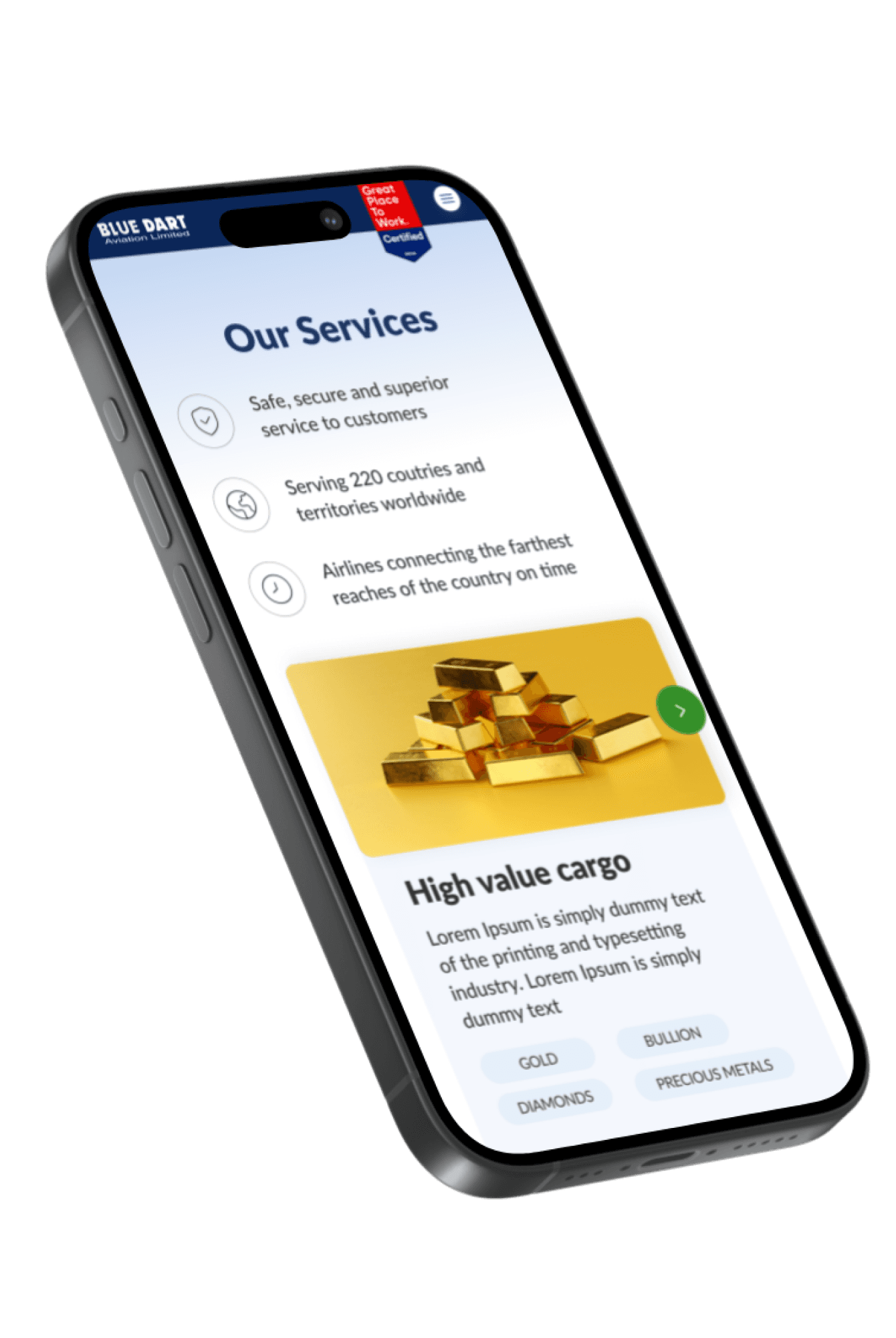
Showcase services, industries served, team,
B757-200 freighters, flight maintenance, achievements, etc.
Explain Blue Dart Aviation heritage/history
DESIGN PROCESS
Below are the steps I followed for revamping the Blue Dart Aviation website.
🔎
Discovey
🗺️
Define
💡️
Ideate
🎨
Design
♻️
Iterate
Discovery
Client shares the requirements.
Conduct stakeholder interview to know all the “why’s”
Understand the business & their ecosystem.
Prepare questionnaire to understand the user behavior, & pain points.
Define
Understands their needs, and we get a good and clear idea.
Write down the requirement based on our understanding.
Define “what the user wants” & “what the business wants”
Ideate
Brainstorm & gathers ideas & references.
Prepare a thought cloud with help of nueue combinations
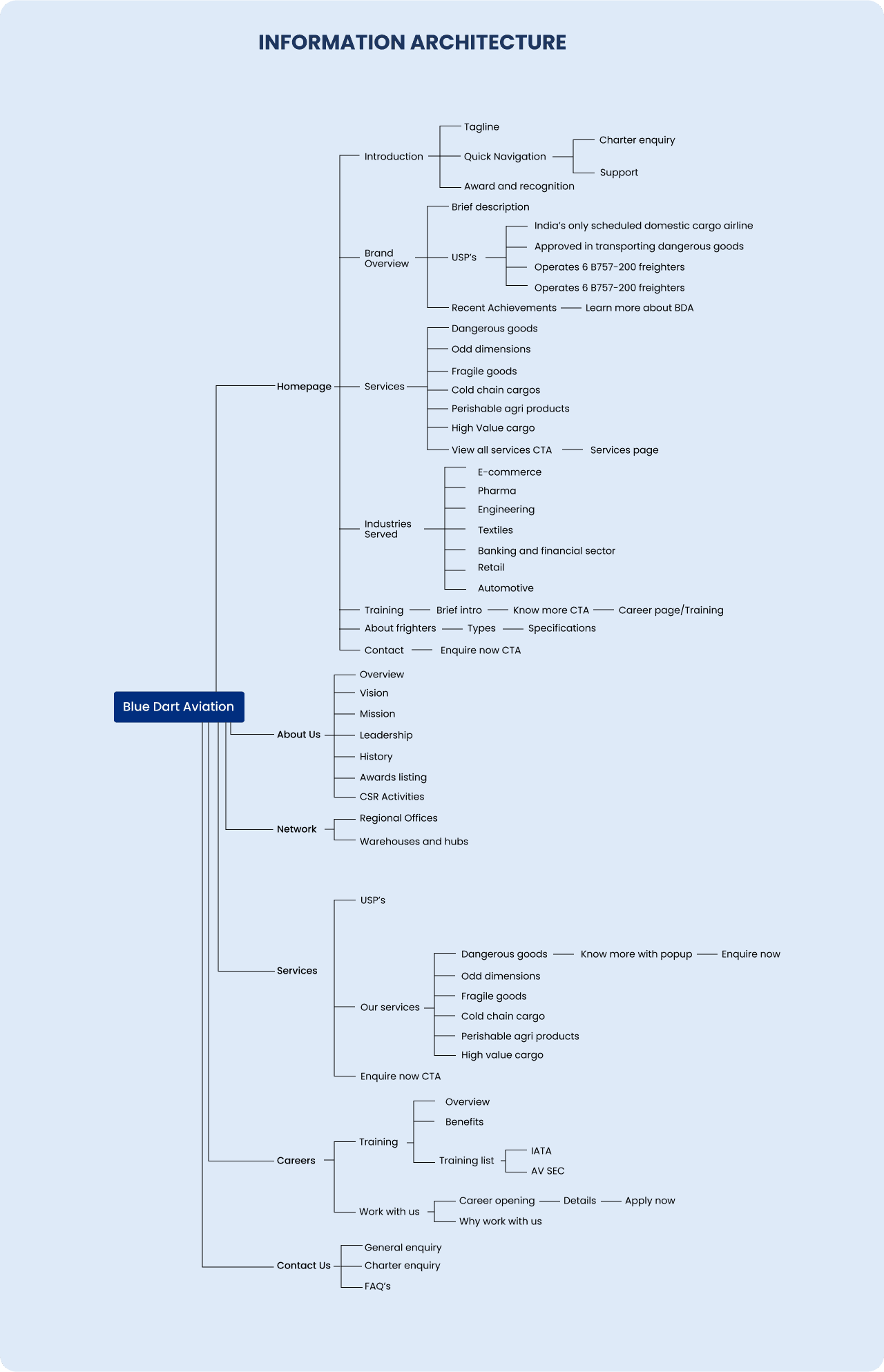
Start with the information architecture
Design
Create high fidelity wireframes & prototyping
Iterate
Usability testing
(A/B testing)
Iterate the design/ Change in requirement
RESEARCH METHODS
Basic Research
Blue Dart Aviation is in the industry of: Airlines, Airports & Air Services, Transportation.
Leaders in domestic air express market specializing in time definite scheduled freight services.
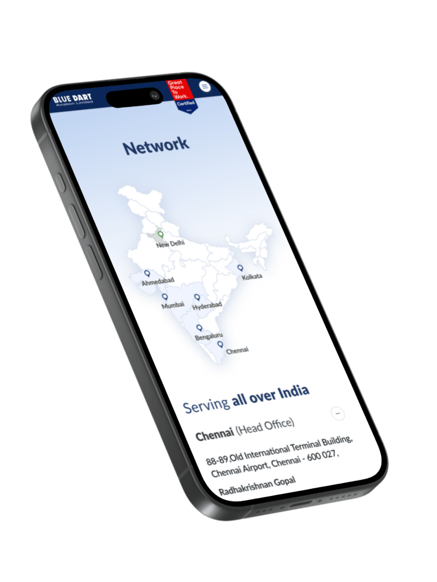
They are a subsidiary of Blue Dart Express Ltd with registered office at Mumbai and head office at Chennai.
Only jet express in India.
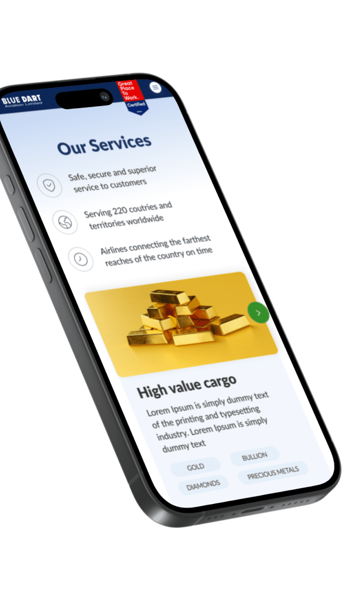
They are carried dangerous goods, odd dimensions goods, emergency response, high value cargo and fragile goods.
Part of CSR activities
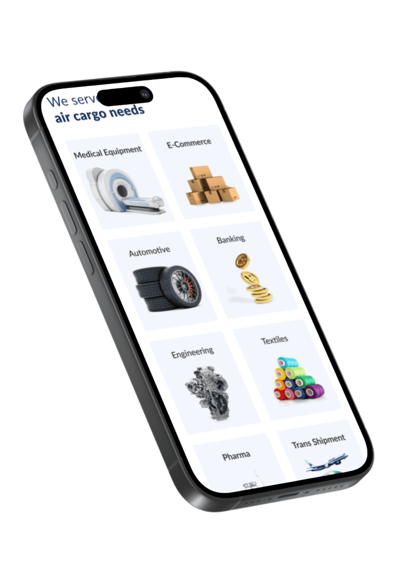
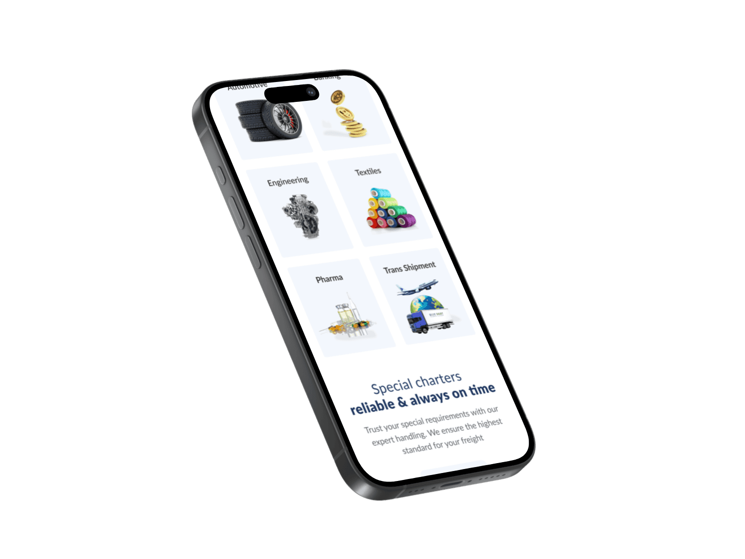
Serving industries like e-commerce, Automobile, Engineering, IT, Banking & Pharma.
An enquiry section is needed for the website that can help redirect the traffic coming to the office.
Oldest and largest courier company In India.
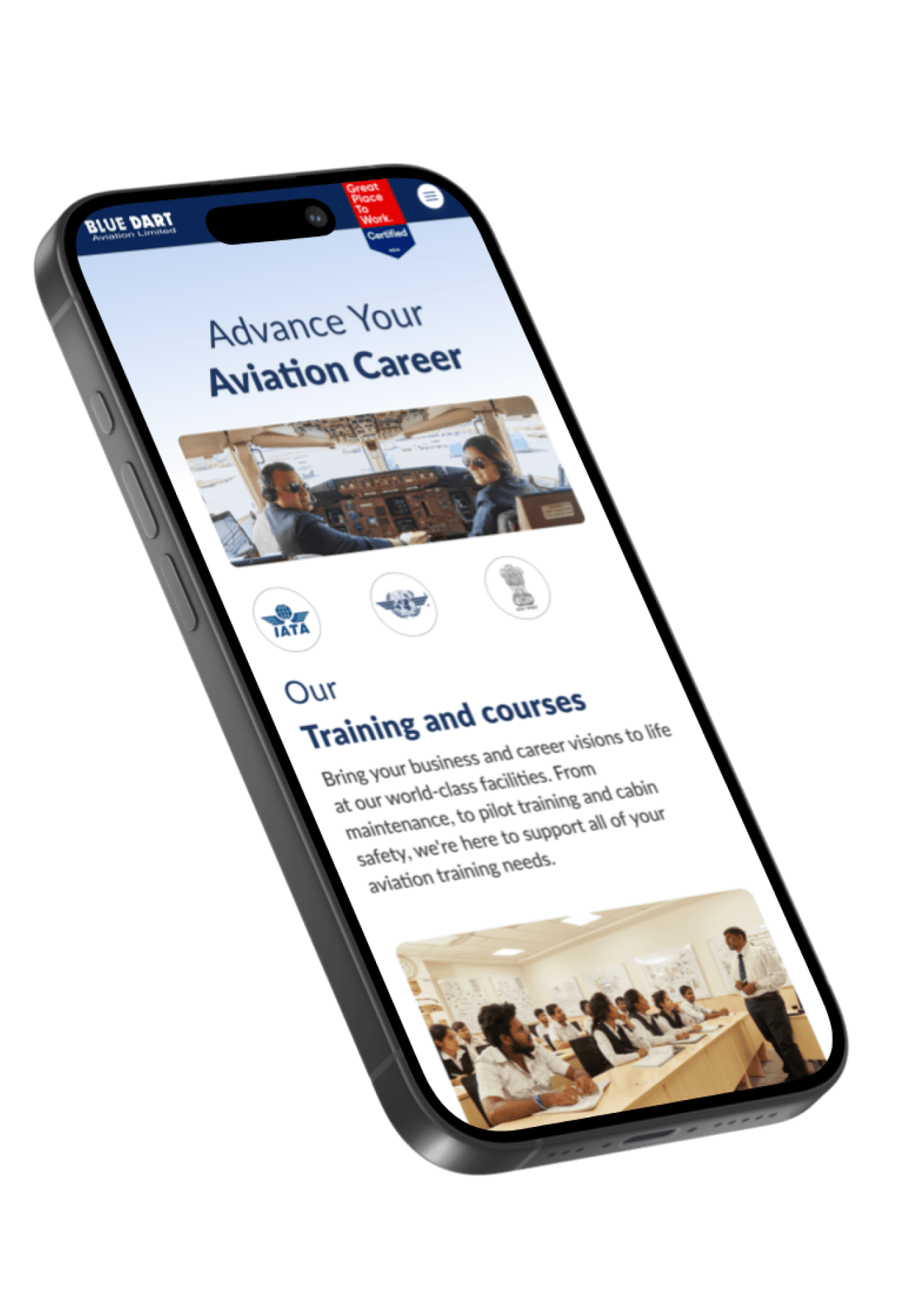
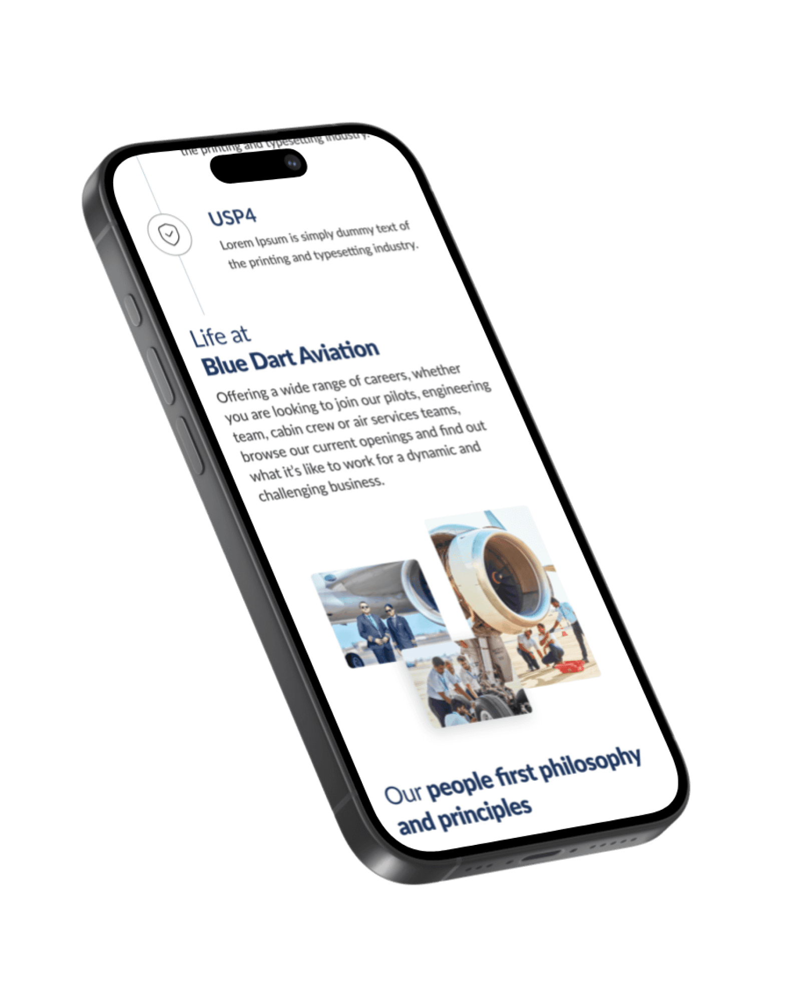
They provide job opportunities to people and also provide aviation courses.
Operates 6 B757-200 freighters with safe and secure with cost-effective service to customers
They provide overnight delivery of express goods.
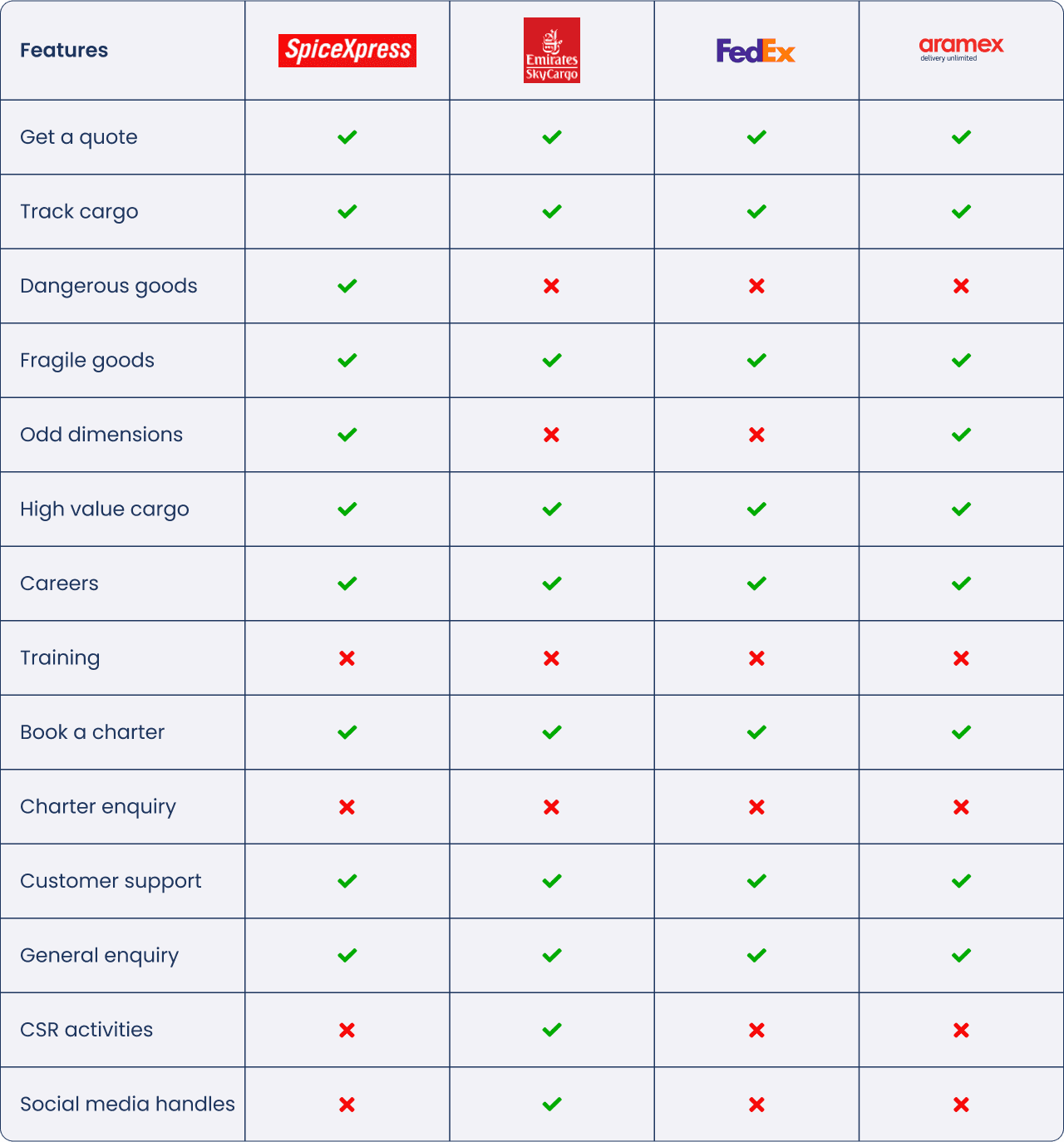
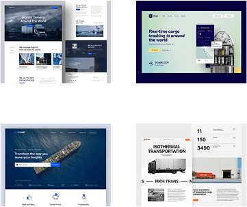
Competitor Analysis
The cargo and air transportation industry is dominated by companies primarily focused on logistics and shipment.
While most competitors emphasize transportation services, Blue Dart differentiates itself by offering specialized air shipment solutions.
A common pattern among these websites is a quote inquiry model, where users can submit shipment details to receive pricing estimates.
User Behavior & Challenges
Based on research, the primary user groups for such platforms include:
Industrialists, government officials, construction experts, and pharmaceutical companies, who seek shipment solutions.
Job seekers, who visit the website to explore career opportunities.
However, the existing website does not effectively facilitate these two key user actions—Charter inquiries and job searches—leading to friction in the user experience.
Interview Insights
(Qualitative Research)
Q. As per our understanding, below are the primary objectives of the Blue Dart Aviation website:
Answer.
Showcase Blue Dart Aviation and heritage/history – Milestone
Showcase Services offered – Training institute, charters, BA calibration LAB and careers
Showcase BDA and capabilities
Milestone
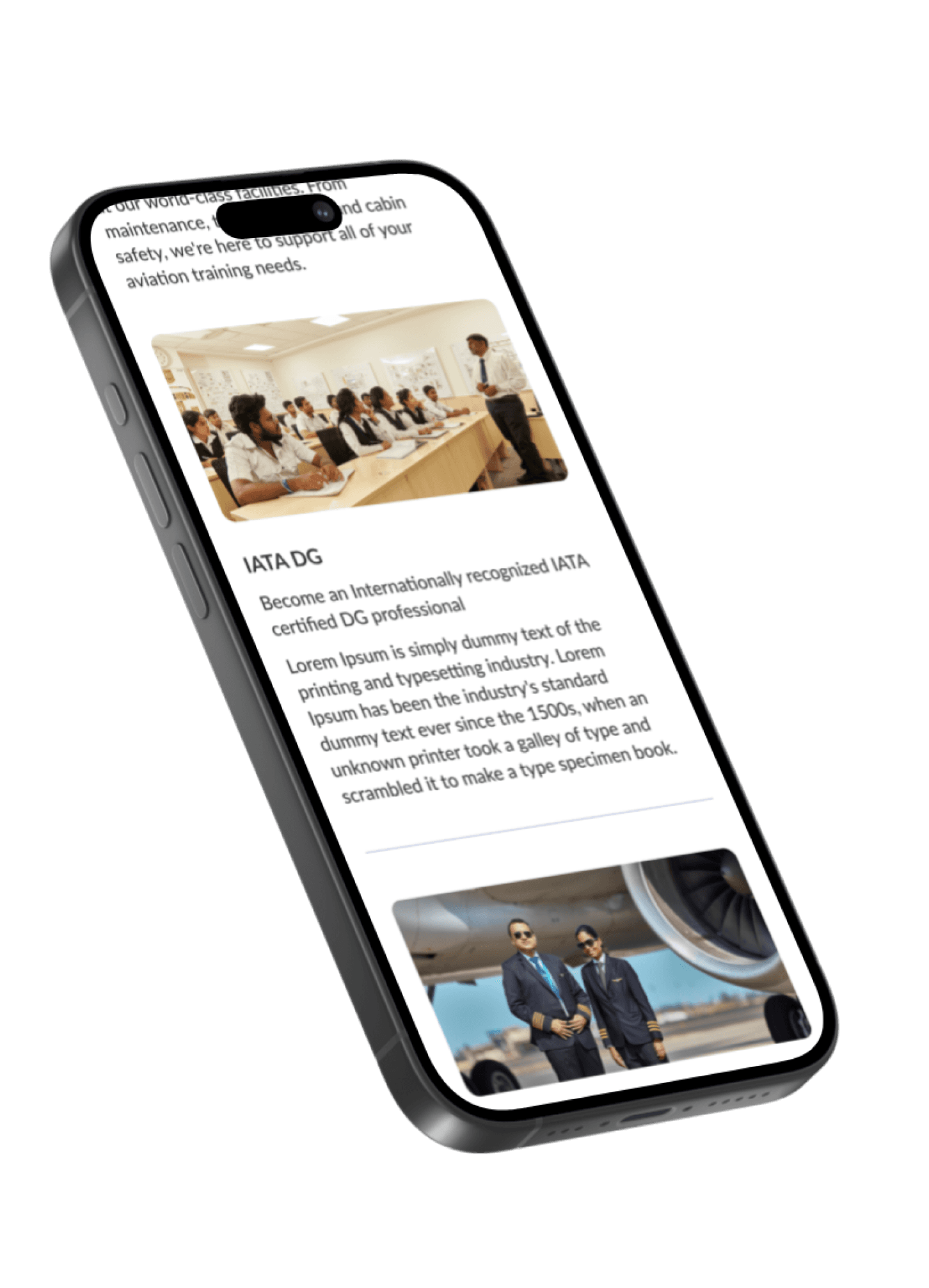
Training (Training program, period, institute, etc)
Q. What are the primary USP's of Blue Dart Aviation? What sets us apart from competitors?
Answer.
India’s only scheduled domestic cargo airline (Scheduled - operates on a schedule as per DGCA.)
Approve to transport dangerous goods
(Dangerous goods include goods that are not permitted to be transported on passenger aircrafts. E.g. Lithium batteries)Operates 6 B757-200 freighters (Boeing 757- best workhorse, irreplaceable in its category- considering size/demand)
Assure safe, secure, cost effective and superior service to customers through highly skilled personnel, quality equipment, timely customer-oriented response and professional management
Emergency response, Scheduled routes and timings
B757-200 freighters (capacity, how to utilize the capacity, how to load, etc),
Range of the aircraft, Weather conditions, special conditions)
Q. Who is your target audience?
Answer.
E-commerce service providers
Freight forwarders (Integrator / End to end service - Blue Dart express - door to door, courier, express company.
Exporters / Importers
Government
Airlines
Potential employees
People seeking career opportunities with Blue Dart Aviation
People who want to know more about Blue Dart Aviation
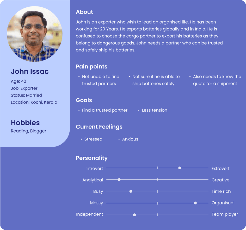
User Persona
Below is a fake persona made on my assumption of the users. The target audience age lies between 25 - 60. I have
created a middle age person who wants to ship batteries that belong to a dangerous good section.
IDEAS & REFERENCES
Brainstorming ideas and references. Creating the best possible outcomes with the Neue Kombinations. Creating a modern website that has the latest technologies and user friendly features and animations that are development friendly.
DESIGNS
High-fidelity Wireframes
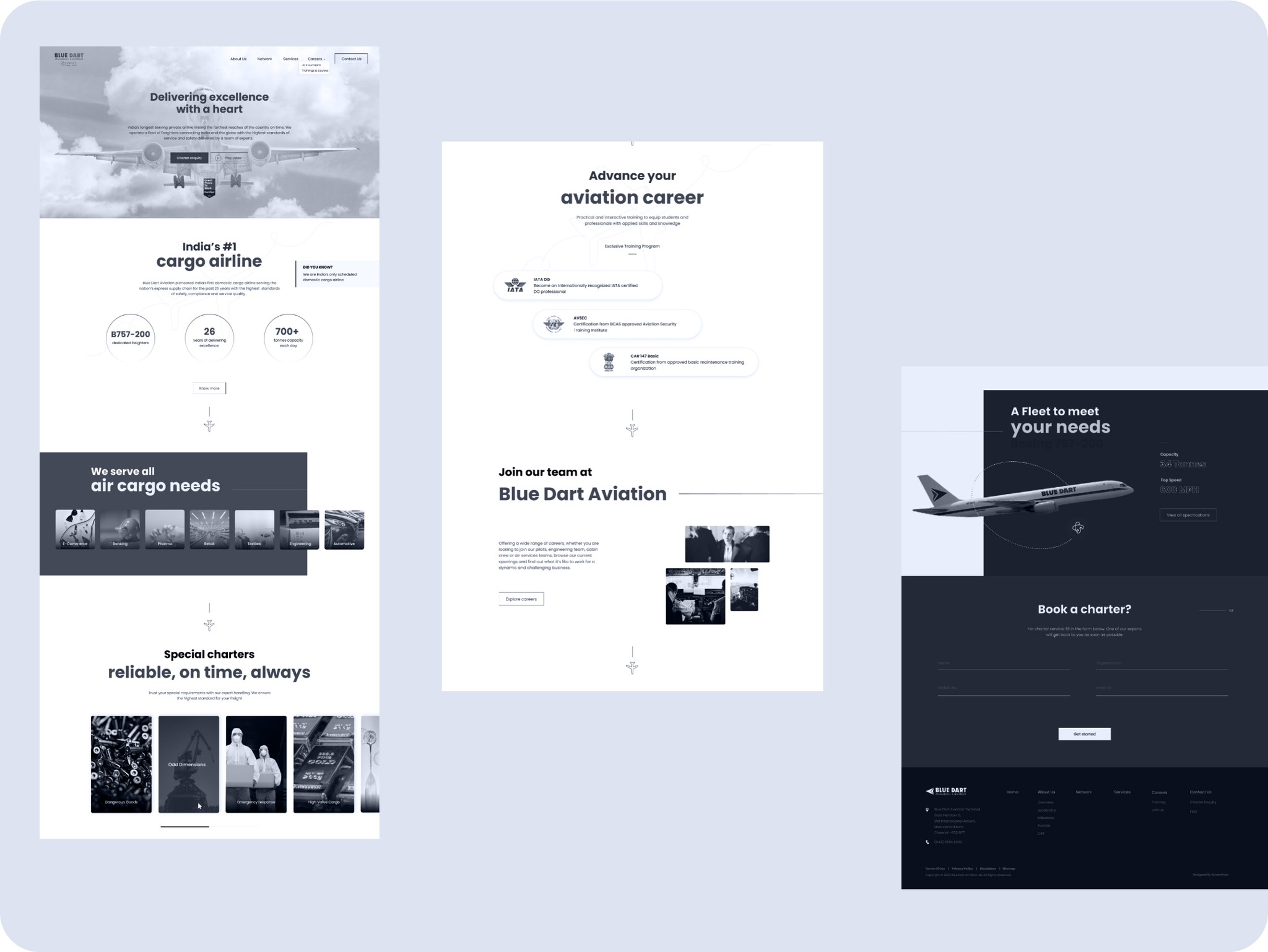
WEBSITE
Testing & Iteration
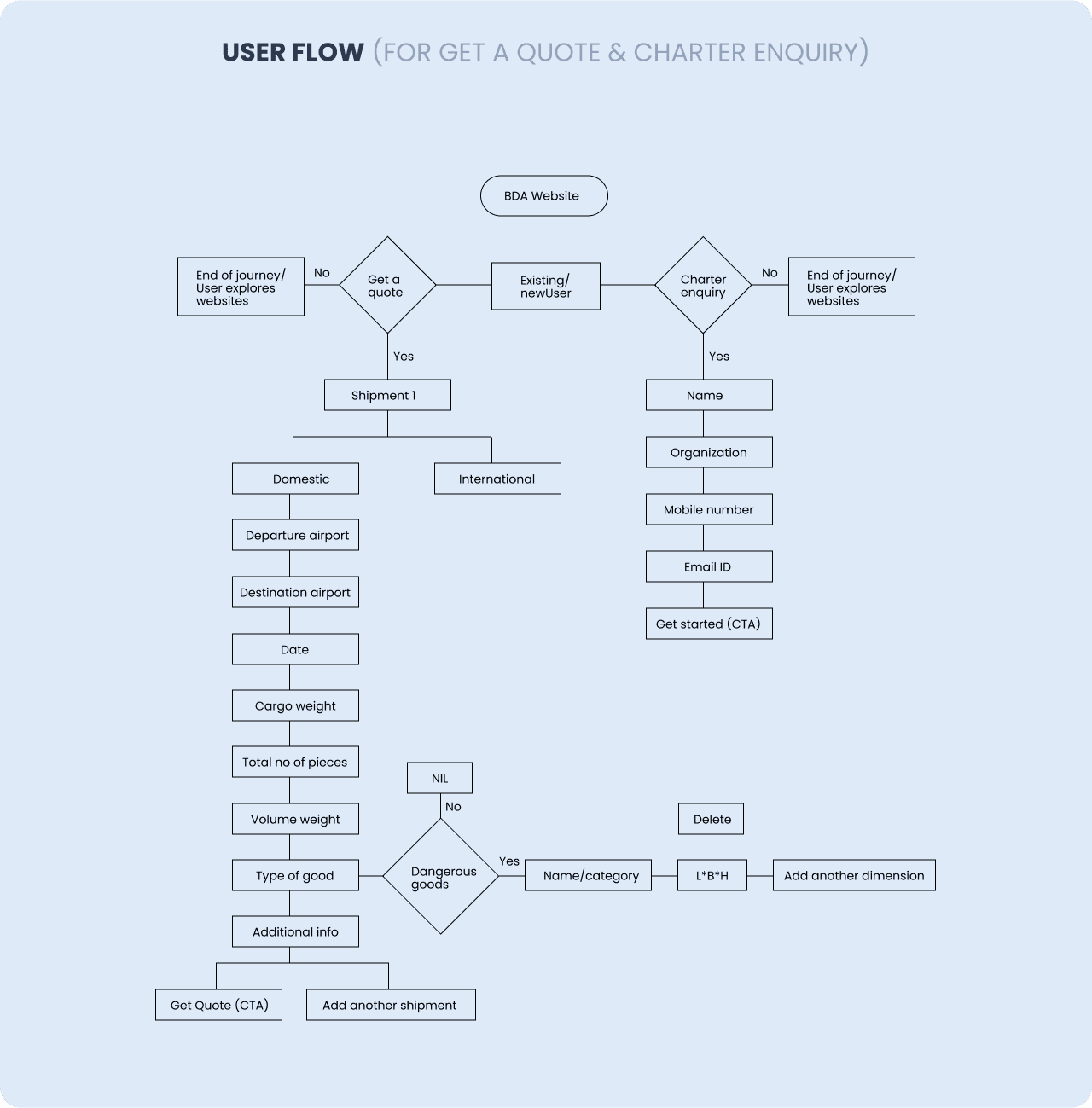
After completing the wireframes, it was presented to certain target audience. The feedback which we have received was to showcase their heritage, CSR activities & services. Also got insights on the Get a quote journey and charter enquiry. Based on the feedback received iterations on wireframes were done and was signed off.
Typeface
Lato
Lato Font is a sans-serif typeface that comes under the Humanist classification. The word ‘Lato’ derives from ‘Summer’ which is designed by Łukasz Dziedzic, a typeface popular designer known for his incredible work throughout his career. It was made public in 2010, after which the font became unstoppable.
Display
H1- ExtraBold / Light
ExtraBold 700 / Light 300 used for hero section title
72px / #1D355E / line spacing 95% | Mobile 48px / line spacing 48
Title style
H1- ExtraBold/Regular
ExtraBold 700 / Regular 400 used for headings
56px / #1D355E / line spacing 110% | Mobile 26px / line spacing 62
H2- ExtraBold/Regular
ExtraBold 700 / Reguler 400 used for headings
52px / #1D355E / #FFFFFF/ line spacing 110%
H3- ExtraBold/Semibold
ExtraBold 700 / Semibold 400 / used for headings
32px / #333333 / #adadad / #FFFFFF / line spacing 120%
H4- Bold/SemiBold
Bold 700 / SemiBold 400 used for headings
24px / #333333 / #FFFFFF / line spacing 120%
H5- Semi Bold
Semi Bold 400 / Regular 300 used for headings
18px / #333333 / #FFFFFF / line spacing 120%
Sub-Heading style
SH 1- Lato / Medium
Medium 500 / used for subheads.
18px /#333333 / #FFFFFF / line spacing 140%
Body copy
Body copy1- Lato Medium / Bold
Lato Medium 500 / Bold 700 for body copy
16px / #333333 / #FFFFFF / line spacing 140%
Body copy1- Lato Medium / Bold
Lato Medium 500 / Bold 700 for body copy
14px / #333333 / #FFFFFF / line spacing 140%
Colors
The choice of color palette is a selection of colors that work together to create consistent and appealing visual look.
The colours are chosen to represent Blue Dart Aviation.
Primary color palette
The primary palette is the complementary color pairs - Blue & Green, white & black. These colours depict modernity, energy and complement the Forward Thinking. They also bring boldness to our brand, establishing our identity as a industry leading company. The colours can be used strategically across the website, collaterals to guide the eye and highlight the important sections.
HEX- 1D355E
BDA-Dark-Blue-Heading
HEX- 348F28
BDA Green
HEX- 0E3193
BDA-Blue
HEX- 333333
BDA_text Dark
Secondary color palette
Secondary colors bring contrast and difference to our primary palette. They are used to highlight small but important items in the UI or make our hero sections pop. Our secondary palette colors soften the experience and to impart confidence, inspiration and optimism.
HEX- F3F7FD
BDA-Card-
Background
HEX- E5F0F9
BDA-Tab-
Background
HEX- 0B111E
BDA-Darkest-Blue-Footer-Background
HEX- ADADAD
BDA-Progressive-Tab-Text-Color (opacity)
HEX- 0B2658
BDA-Slider-Text-Background
Text colors
Para Text
HEX- 333333
Text
HEX- E5F0F9
Gradient
Style 1
HEX- 0B2658
HEX- 2B3F62
Buttons
Buttons allow users to take actions, and make choices, with a single tap.
Primary button
Primary buttons communicate actions that users can take. They are typically placed throughout the UI.
Default
View All Services
Text Lato Bold / #FFFFFF/ Button H 15px / Color #348F28 / Padding 35pxl
Secondary
Contact
Text Lato Bold / Stroke #ffffff / Button H 8px / Color #0E3193 / Padding 30pxl
Percentages and Purpose
BDA White wash
Bright color used as background throughout the website
BDA Green
Primary Green mainly used for all Button
BDA Blue
Primary Blue mainly used for Tab Button
BDA Text Dark
Dark Blue color used for Text
BDA Dark Blue Heading
Dark Blue primarily used for Section headers
BDA Card Background
Mainly used for Product background of Slider
BDA Tab Background
Baground used for Secondary Tab
BDA Darkest Blue Footer Background
Dark Blue primarily used for Section Footer
BDA Progressive Tab Text Color (opacity)
Mainly used for Primary Tab Inactive Text
BDA Gradient
Mainly used for backround Section and Slider Text
Icons
( icon size 72px )
Primary Icon

( icon size 42px )
Secondary Icon
Tabs
Tabs organize and allow navigation between groups of content that are related and at the same level of hierarchy.
Primary tabs
B757-200
dedicated freighters
26 Years
of delivering excellence
700+ Tonnes
Capacity every day
Secondary Tab
BOEING 737 -800
BOEING 757-200
Lato ExtraBold 16px / #ffffff /
Button H 15px / Color #0E3193 / Padding 25pxl
Inactive Text Color #7e8183

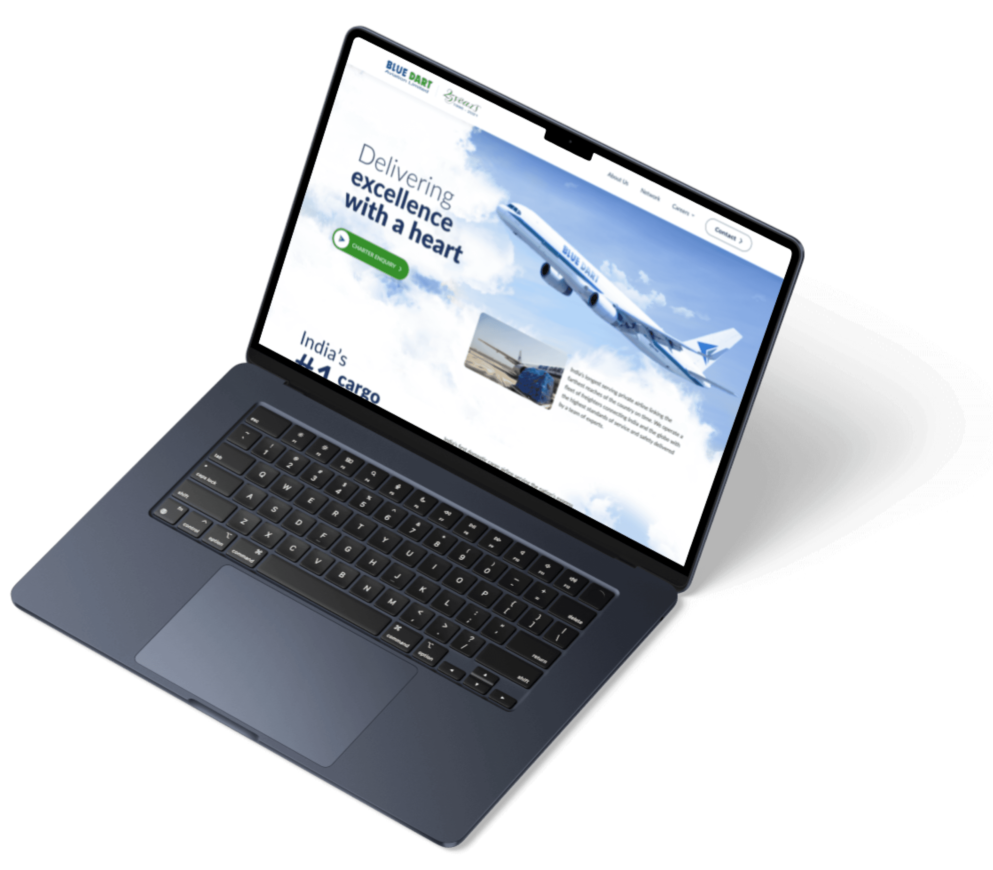
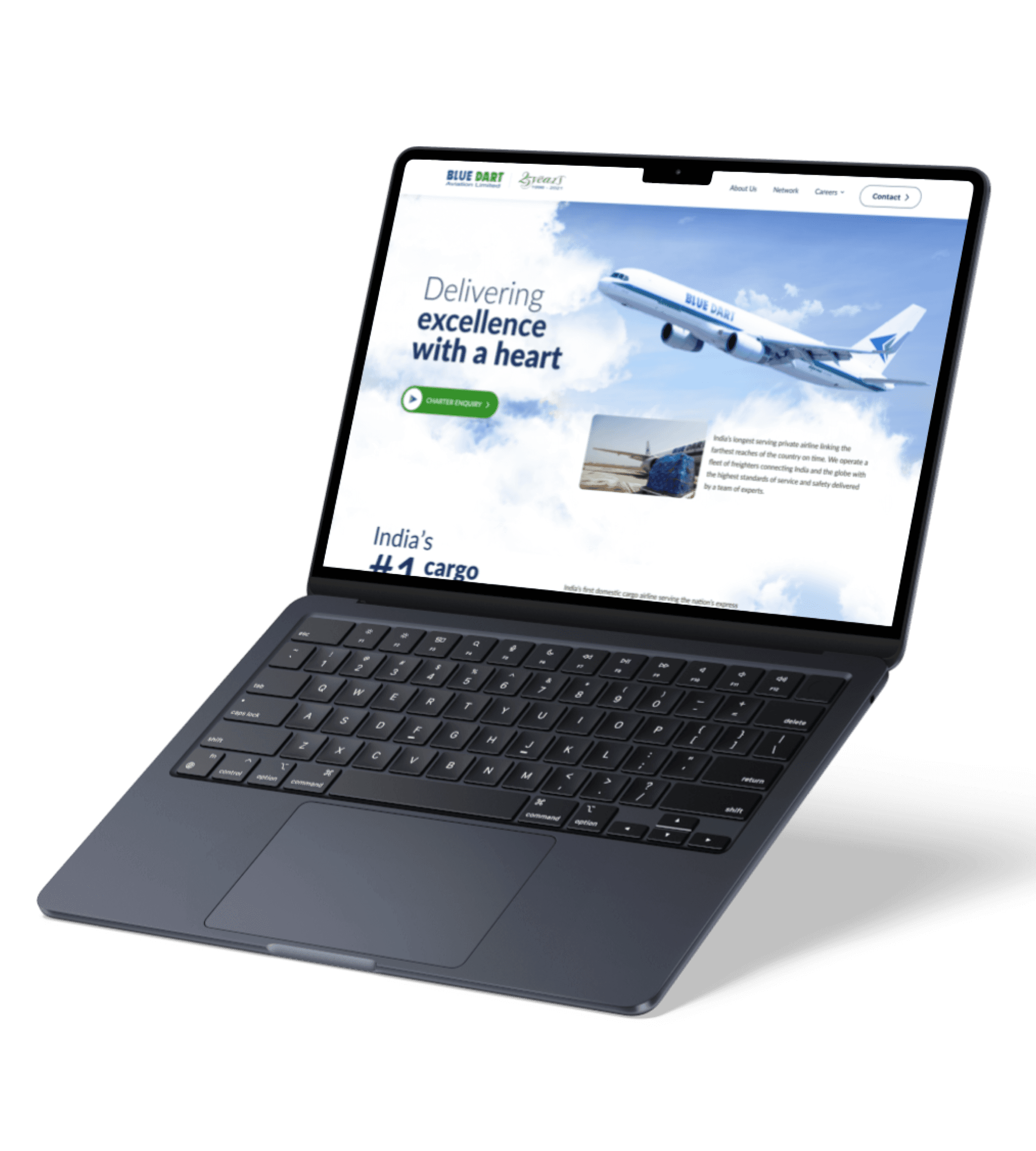
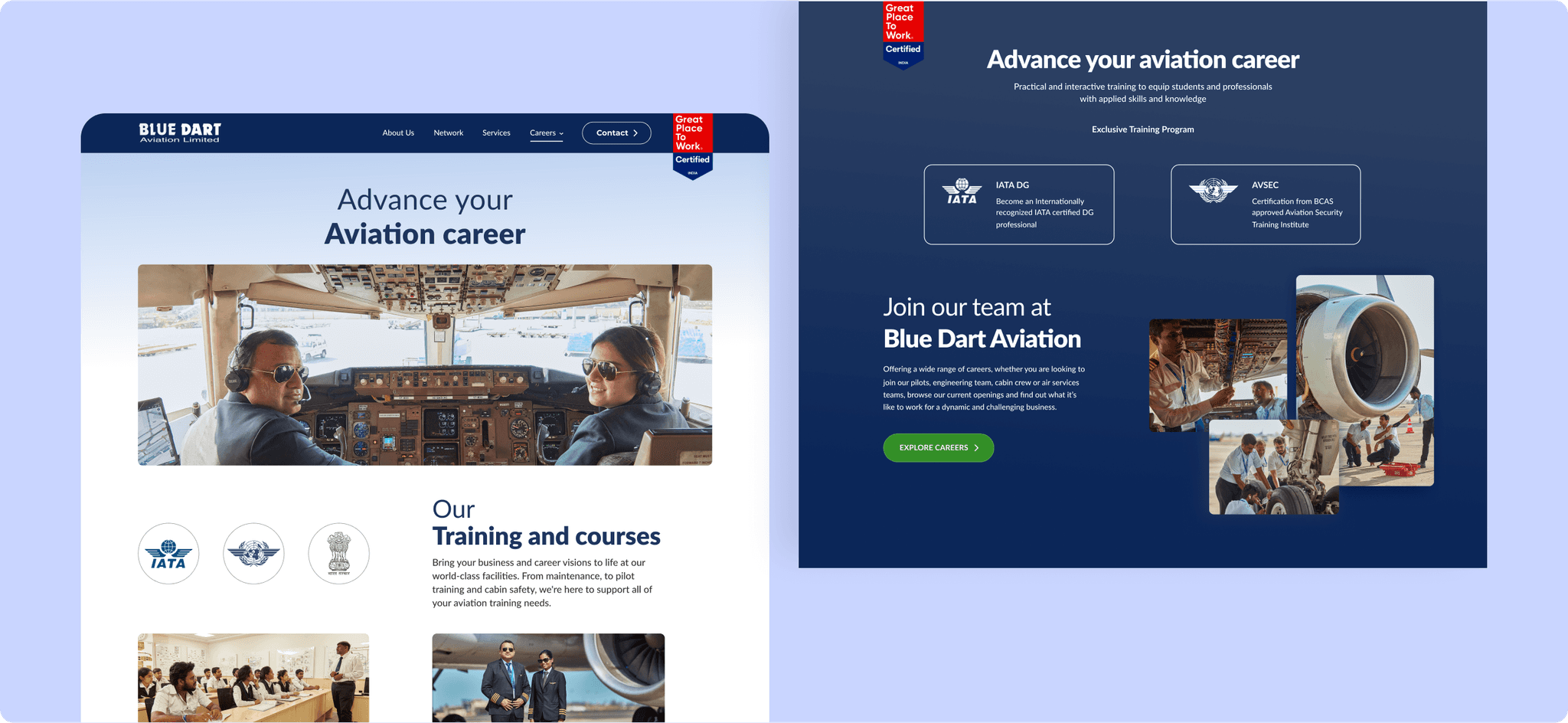
Driving Digital Transformation
Despite being a leading cargo airline, Blue Dart Aviation previously lacked a dedicated digital presence, relying solely on Blue Dart’s main website for business inquiries. The redesign focused on creating a visually engaging interface and smooth user experience to establish an independent online identity for Blue Dart Aviation. Through clean UX patterns and intuitive navigation, the new platform guides users toward meaningful business interactions, ultimately driving conversions and enhancing the airline’s digital performance.
Streamlining User Experience Across Functions
Blue Dart Aviation previously relied on Blue Dart’s main website for business inquiries, lacking a dedicated digital presence. The new platform focused on establishing an independent identity with a visually engaging interface and intuitive navigation, guiding users toward meaningful business interactions and driving conversions.
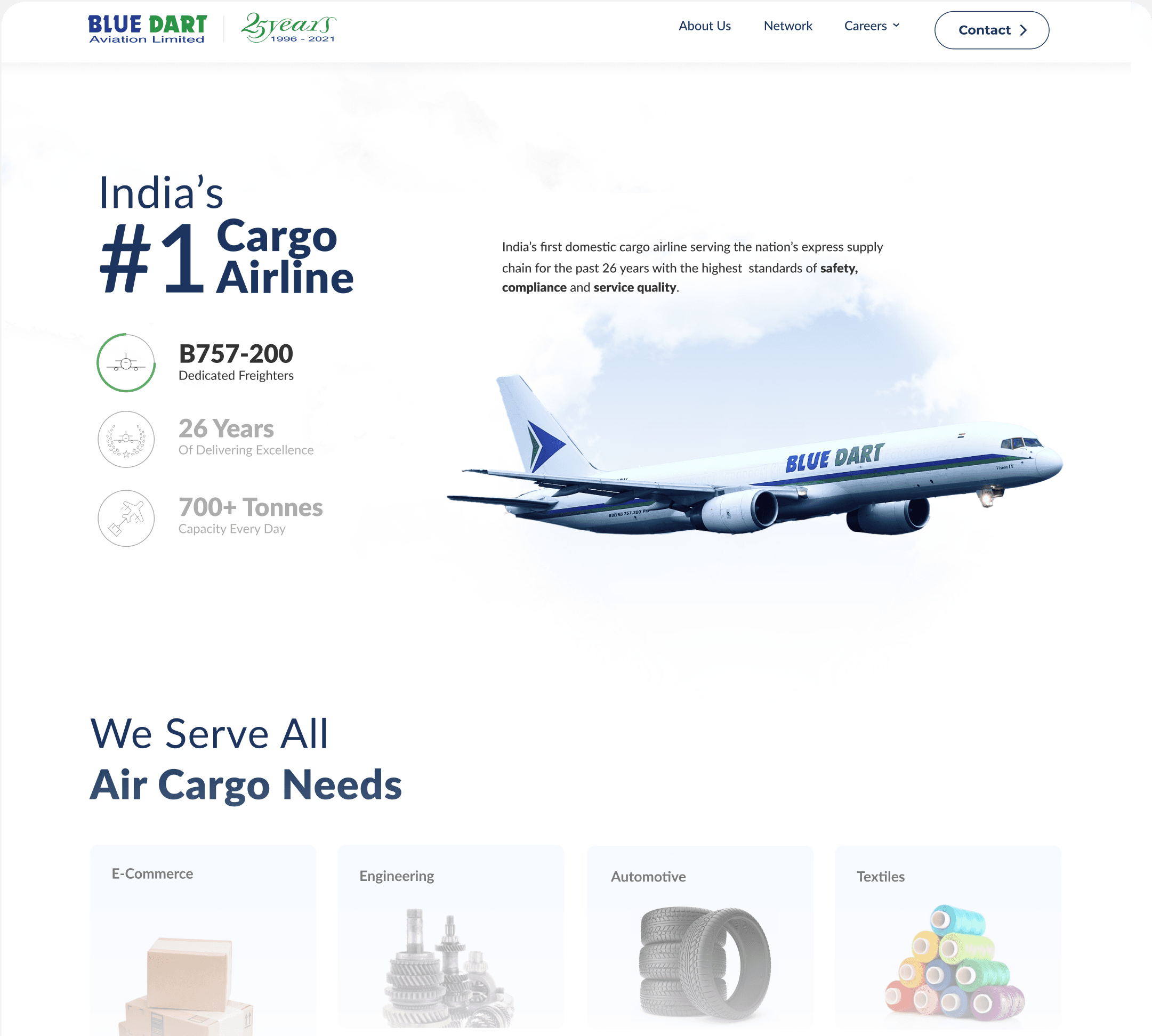
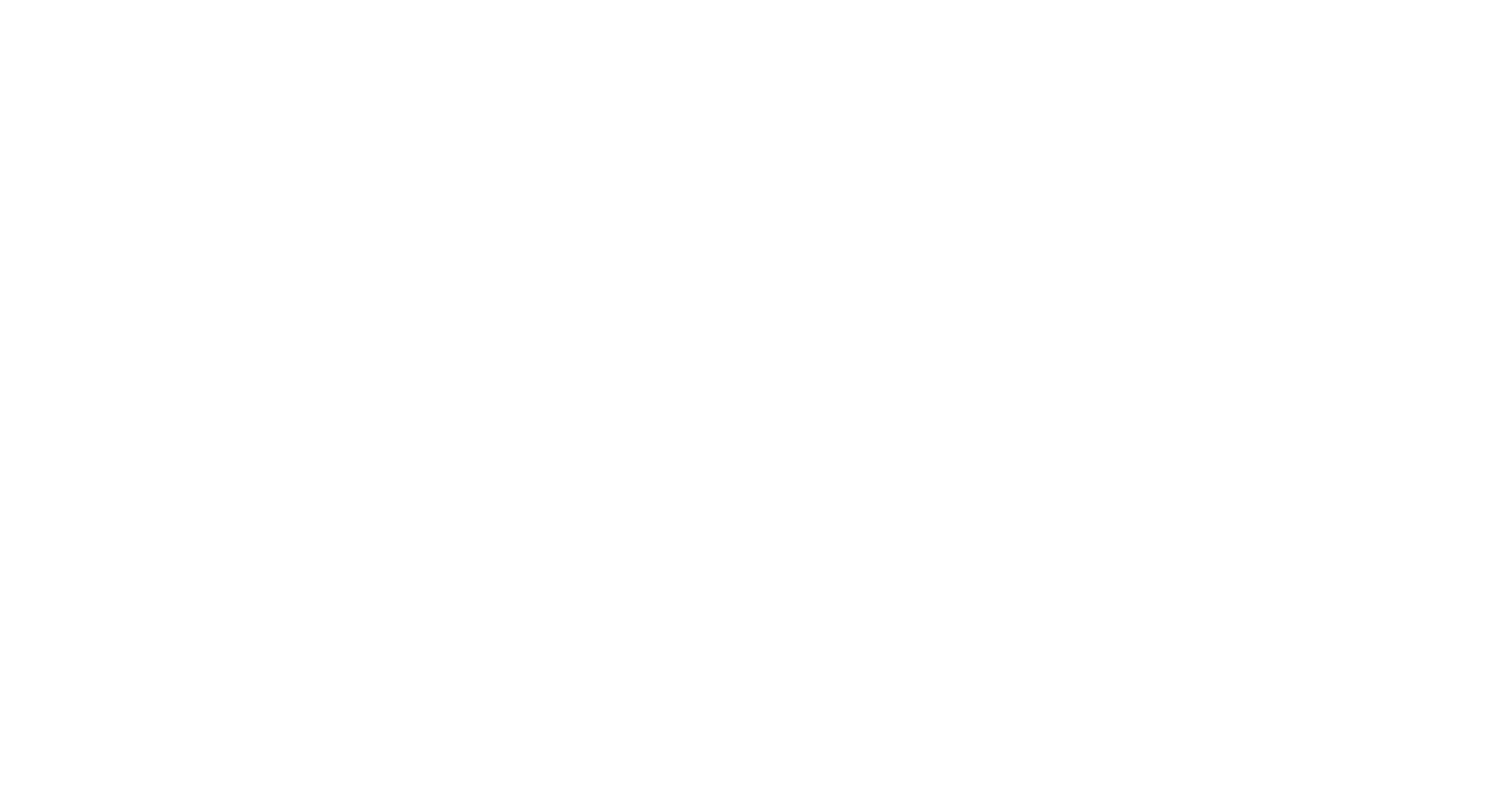
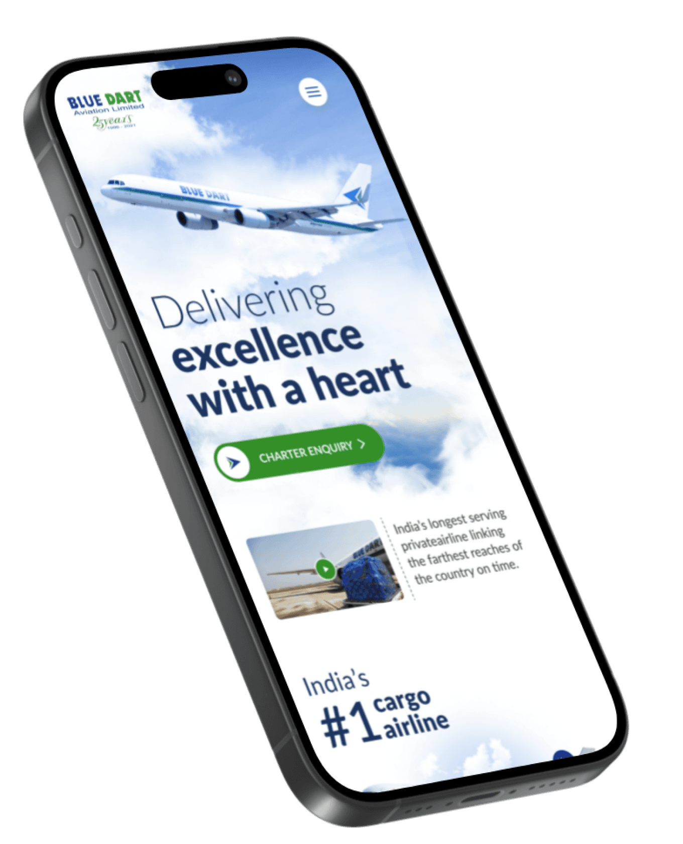
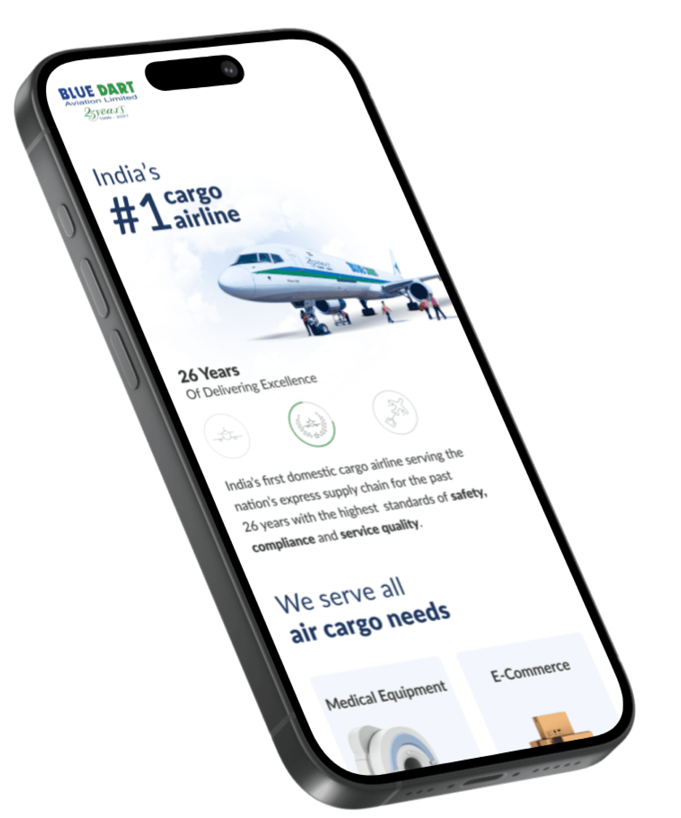
A Quarter Century and Counting
The 2021 website launch coincided with Blue Dart Aviation's 25th anniversary, celebrating their role as India’s first cargo airline. The platform highlighted their premier services and industry achievements, emphasizing continued excellence in the cargo sector
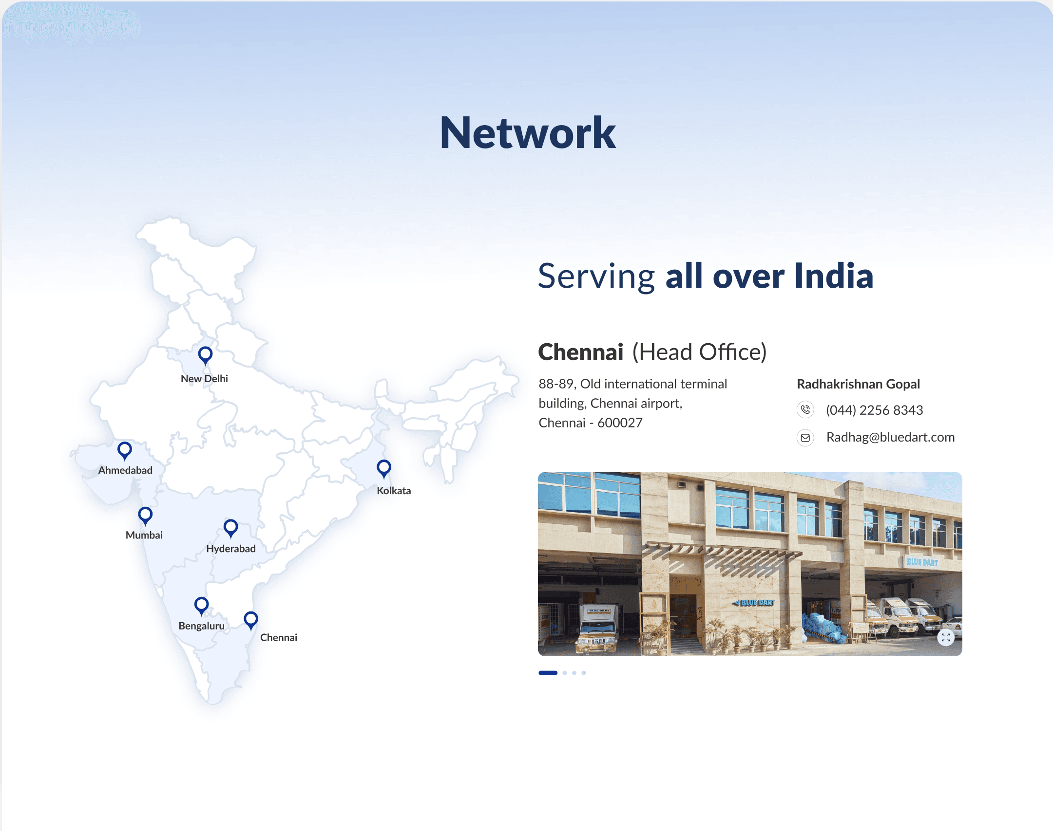
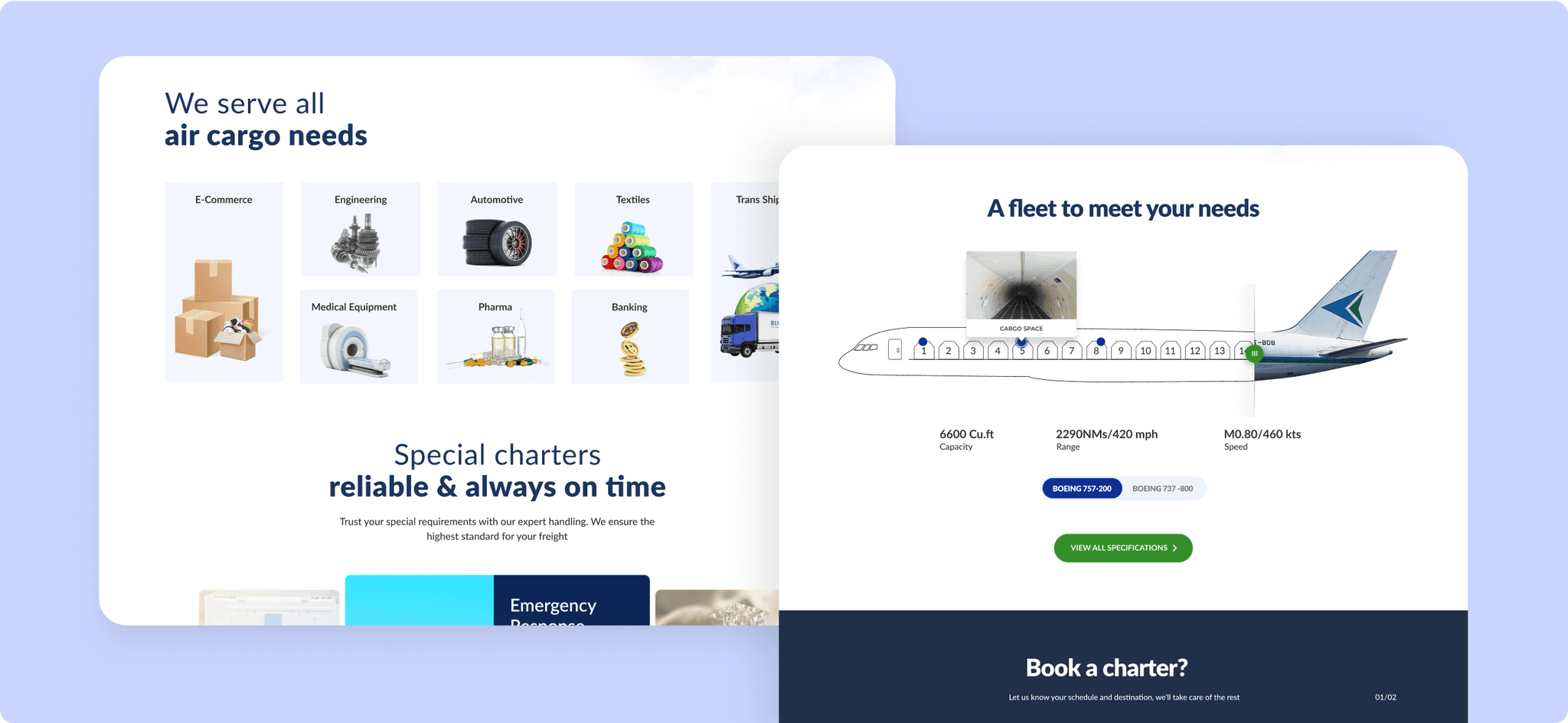
Sleek, Stylish, & Service-Oriented
The design features an inside view of the aircraft fleet and an interactive map of the nationwide network, paired with a sleek blue and white aesthetic to emphasize efficiency and service.
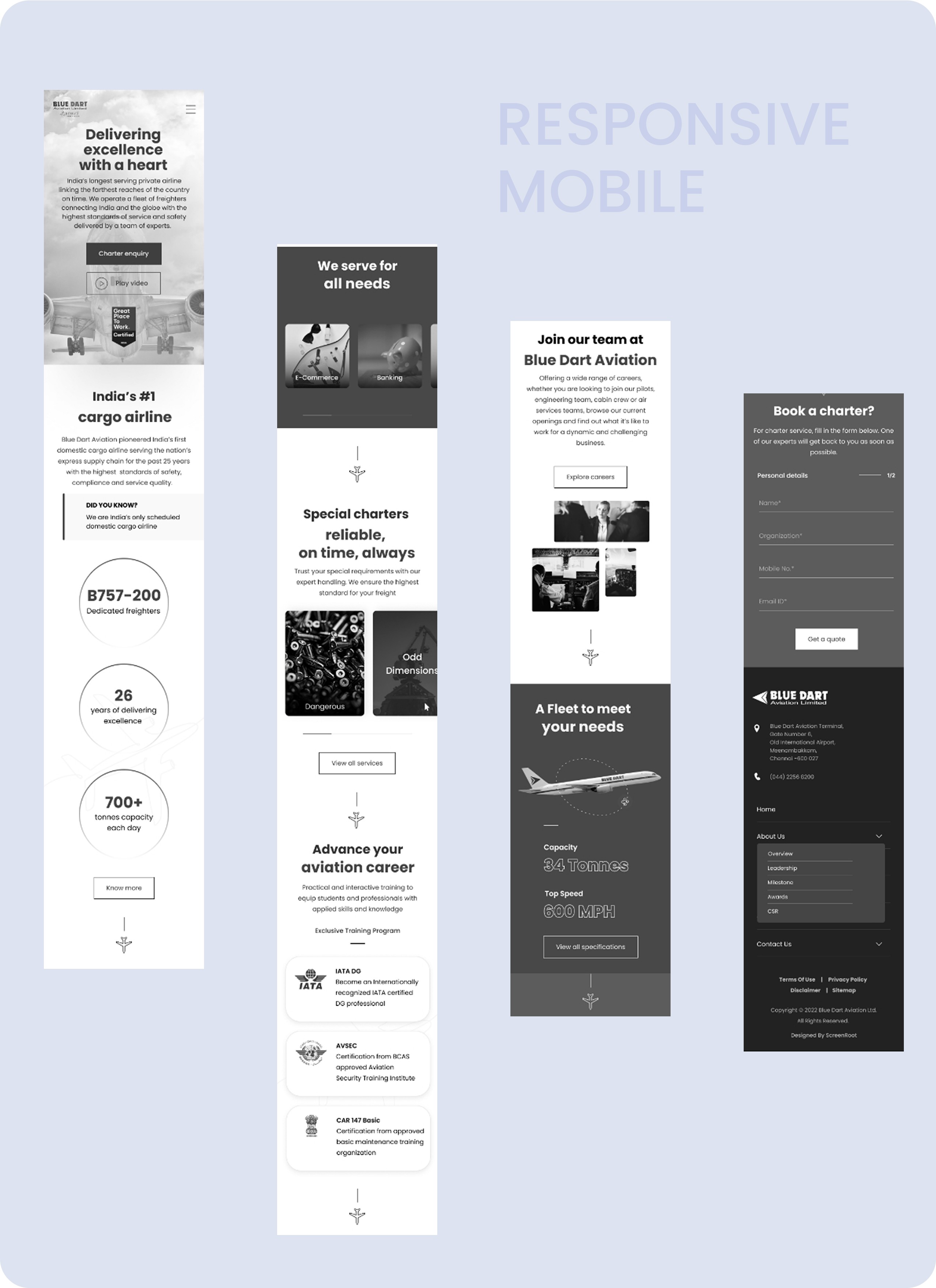
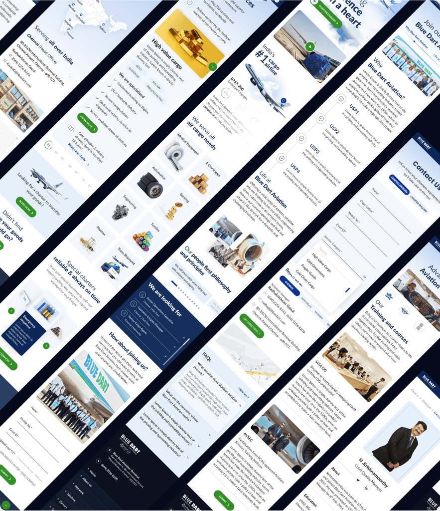
Mobile responsive design - for quick & easy accessibility
Responsiveness ensures seamless browsing, enabling travelers to access information and services effortlessly on any device
Thank you!
Let's connect and develop deeper into the project together!