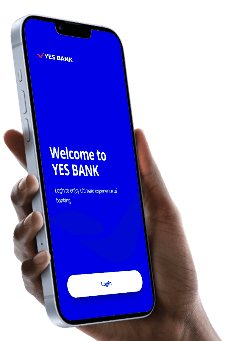
YES BANK | IRIS Mobile App
YES BANK | IRIS Mobile App
Project Overview
Yes Bank came with the requirement to upscale their legacy app into a modern,
user-friendly platform for acquiring and servicing customers directly.
The vision was to create an integrated online banking experience, offering end-to-end user support and efficient digital journeys, replicating the ease of visiting a local branch.
This project involved a comprehensive overhaul of the app’s UI design, accompanied by a restyling of Yes Bank’s digital assets and visual language.
The new style was then extended to the website, ensuring a cohesive online user experience across all digital touchpoints.
Project Overview
Yes Bank came with the requirement
to upscale their legacy app into
a modern, user-friendly platform for
acquiring and servicing customers directly.
The vision was to create an integrated online banking experience, offering end-to-end user support and efficient digital journeys, replicating the ease of visiting a local branch.
This project involved a comprehensive overhaul of the app’s UI design, accompanied by a restyling of Yes Bank’s digital assets and visual language.
The new style was then extended to the website, ensuring a cohesive online user experience across all digital touchpoints.
Problems & challenges
Overwhelming Navigation
The app had a broad range of services, making it challenging to present all features without overwhelming users.
Outdated Interface
The outdated interface did not support modern user expectations or the efficient execution of banking tasks.
Maintaining Cohesiveness
Ensuring a consistent user experience across mobile app and website platforms while redesigning the visual language.
Low User Engagement
The app needed to encourage more frequent use and interaction, as many users found it difficult to navigate and less intuitive.
Limited Personalization
The previous app lacked personalized
features that could cater to individual user
needs and preferences.
Brand Consistency
The app's design needed to match Yes Bank's updated brand identity and ensure a consistent look across the app and website.
Pain Points
Difficulty in accessing key banking features due to cluttered menus.
Inconsistent design elements across different platforms leading to a disjointed user experience.
Confusing interface for users unfamiliar with digital banking processes.
Overloaded screens with too much information, making it hard for users to focus on key tasks.
Lack of clear guidance or prompts for new users, leading to confusion during onboarding.
Limited customization options, making it difficult for users to personalize their experience based on their preferences.
Needs
Simplified Navigation: Easy-to-use navigation to access core banking functions like payments, transfers, and investments.
Consistent Design: A visually appealing interface that feels modern yet familiar.
Clear Onboarding: Simple, step-by-step guidance for new users to help them understand how to use the app effectively.
Personalization: Personalized features and offers that enhance user engagement and trust in the app.
Focused Interface: Cleaner screens with less clutter, allowing users to focus on completing their tasks efficiently without distractions.

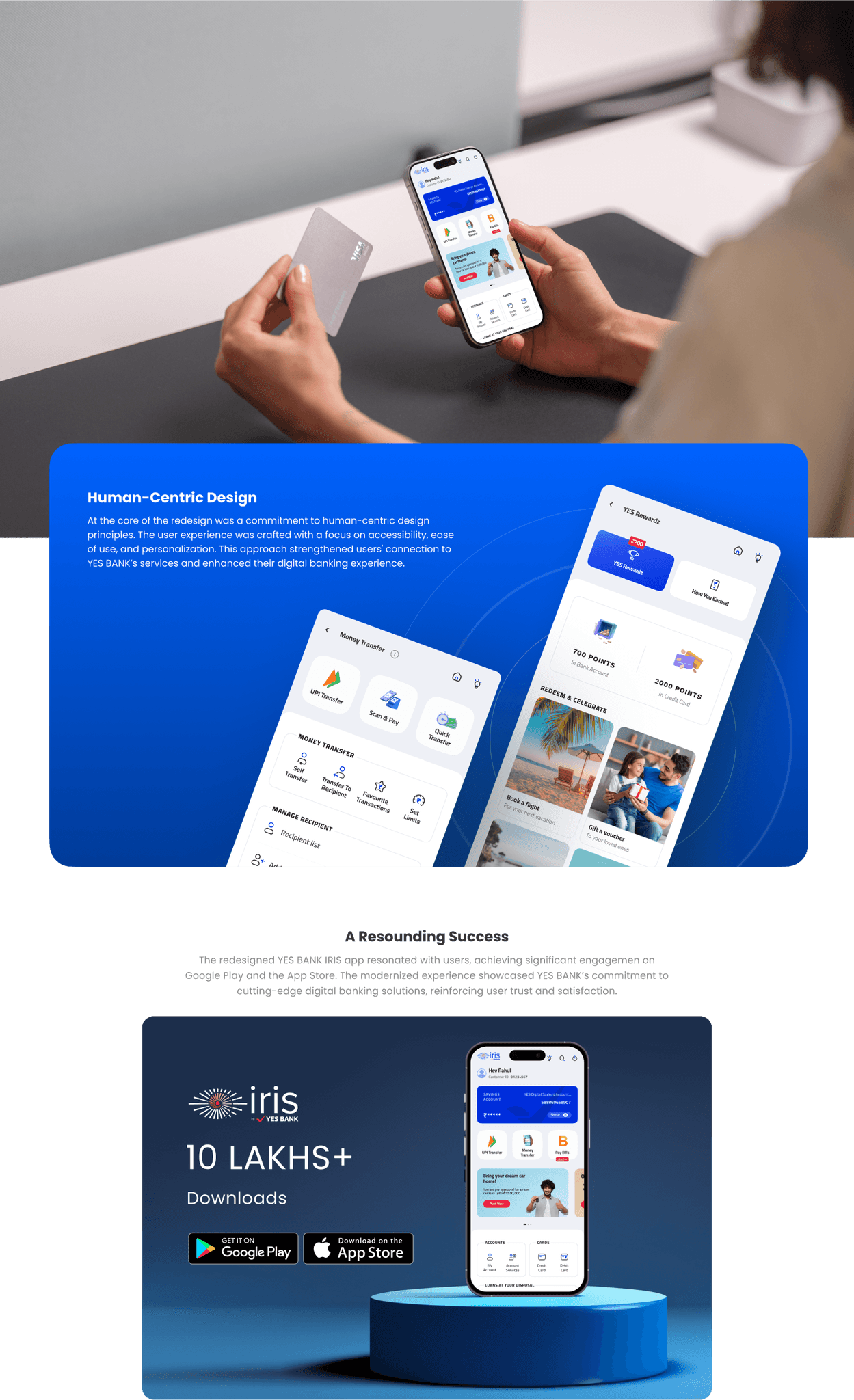
Design Goal
To design a cohesive, user-centered interface that simplifies core banking tasks such as payments, transfers, and account management. The interface should balance familiarity for existing users with modern, intuitive design elements that make it easy for new users to navigate. Key focus areas include improving usability by reducing unnecessary steps, offering personalized features based on user preferences, and ensuring consistent interaction across both the mobile app and website.
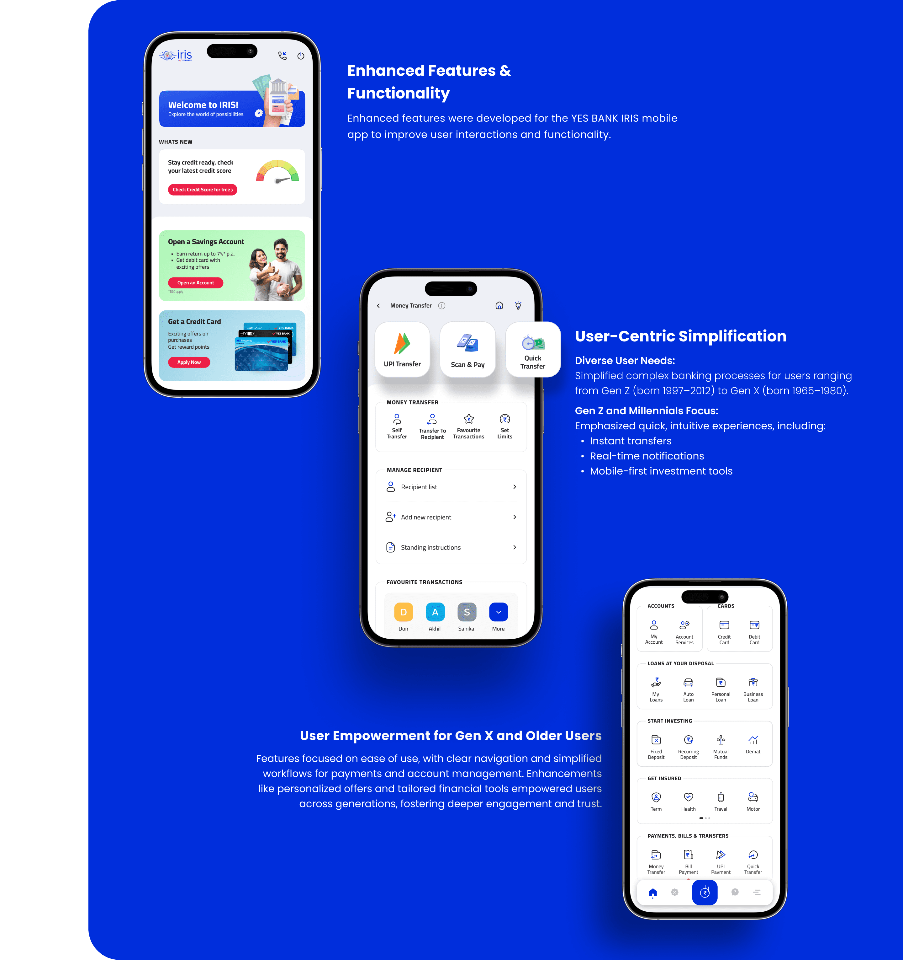
The design should cater to diverse user needs by providing clear visual cues, accessible layouts, and a streamlined user flow that adapts to different levels of tech literacy.
To design a cohesive, user-centered interface that simplifies core banking tasks such as payments, transfers, and account management. The interface should balance familiarity for existing users with modern, intuitive design elements that make it easy for new users to navigate. Key focus areas include improving usability by reducing unnecessary steps, offering personalized features based on user preferences, and ensuring consistent interaction across both the mobile app and website.
The design should cater to diverse user needs by providing clear visual cues, accessible layouts, and a streamlined user flow that adapts to different levels of tech literacy.
key Research insights
Navigation & Usability
Quick Access: Quick Access: Users wanted prominent, one-tap access to essential features like account balances and quick transfers.
Intuitive Flow: Participants highlighted the need for logical flow between screens, where actions naturally lead to the next step without confusion.
Personalization & Customization
Custom Shortcuts: Users expressed interest in setting up custom shortcuts for their most-used banking actions, improving efficiency.
Tailored Notifications: Personal alerts for transactions, offers, and account updates were seen as highly valuable, especially for users who wanted better financial management.
Onboarding & Support
In-App Help: Users consistently mentioned the need for a clearly visible help section for troubleshooting without leaving the app.
Progressive Onboarding: New users desired a staged onboarding process where more complex features are introduced gradually, based on user behavior and needs..
User Preferences
Generational Differences: Gen Z and Millennials preferred a mobile-first approach with real-time notifications, while Gen X valued simplicity and ease of use over advanced features.
Feature Discovery: Many users requested easier ways to discover and explore new features within the app, including prompts or highlights for updates.
Problems & challenges
Overwhelming Navigation
The app had a broad range of services, making it challenging to present all features without overwhelming users.
Outdated Interface
The outdated interface did not support modern user expectations or the efficient execution of banking tasks.
Maintaining Cohesiveness
Ensuring a consistent user experience across mobile app and website platforms while redesigning the visual language.
Low User Engagement
The app needed to encourage more frequent use and interaction, as many users found it difficult to navigate and less intuitive.
Limited Personalization
The previous app lacked personalized
features that could cater to individual user
needs and preferences.
Brand Consistency
The app's design needed to match Yes Bank's updated brand identity and ensure a consistent look across the app and website.
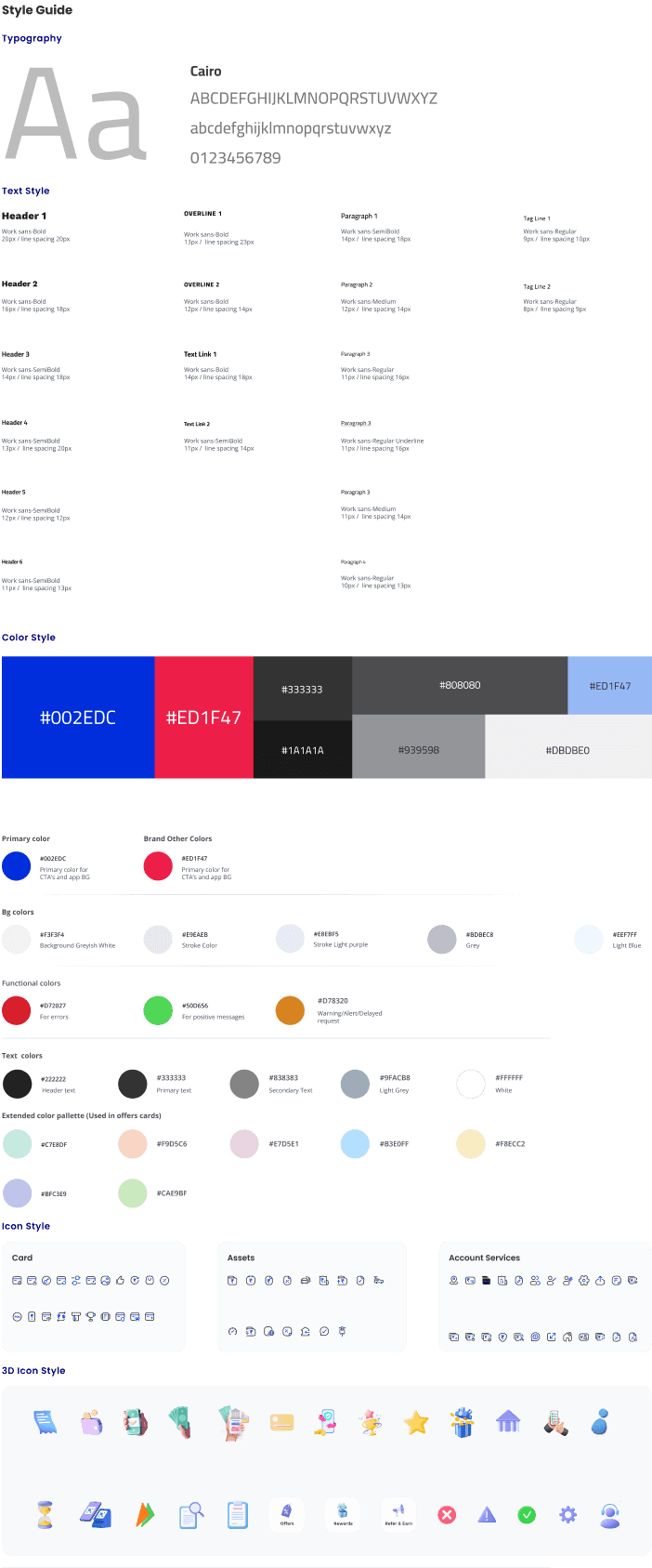
Style Guide
Typography
a
a
Cairo
ABCDEFGHIJKLMNOPQRSTUVWXYZ
abcdefghijklmnopqrstuvwxyz
0123456789
Text Style
Header 1
Paragraph 2
Header 2
Paragraph 3
Header 3
Paragraph 3
Header 4
Paragraph 3
Header 5
Header 6
Paragraph 4
Tag Line 1
OverLine 1
Tag Line 2
OverLine 2
Work sans-Bold
20px / line spacing 20px
Work sans-Medium
12px / line spacing 14px
Paragraph 1
Work sans-SemiBold
14px / line spacing 18px
Work sans-Regular
9px / line spacing 10px
Work sans-Bold
13px / line spacing 23px
Work sans-Regular
8px / line spacing 9px
Work sans-Bold
12px / line spacing 14px
Text Link 2
Work sans-SemiBold
11px / line spacing 14px
Text Link 1
Work sans-Bold
14px / line spacing 18px
Work sans-Bold
16px / line spacing 18px
Work sans-Regular
11px / line spacing 16px
Work sans-SemiBold
14px / line spacing 18px
Work sans-Regular Underline
11px / line spacing 16px
Work sans-SemiBold
13px / line spacing 20px
Work sans-Medium
11px / line spacing 14px
Work sans-SemiBold
12px / line spacing 12px
Work sans-SemiBold
11px / line spacing 13px
Work sans-Regular
10px / line spacing 13px
Color Style
#002EDC
#ED1F47
#1A1A1A
#333333
#939598
#DBDBE0
#ED1F47
#808080
Primary color
Brand Other Colors
#002EDC
#ED1F47
Primary color for CTA’s and app BG
Primary color for CTA’s and app BG
Bg colors
Background Greyish White
#F3F3F4
Stroke Light purple
#E8EBF5
Stroke Color
Grey
Light Blue
#E9EAEB
#BDBEC8
#EEF7FF
Functional colors
For errors
#D72027
For positive messages
#50D656
Warning/Alert/Delayed request
#D78320
Text colors
#222222
Header text
Primary text
#333333
Secondary Text
#838383
Light Grey
#9FACB8
White
#FFFFFF
Extended color pallette (Used in offers cards)
#C7E8DF
#BFC3E9
#F9D5C6
#CAE9BF
#E7D5E1
#B3E0FF
#F8ECC2
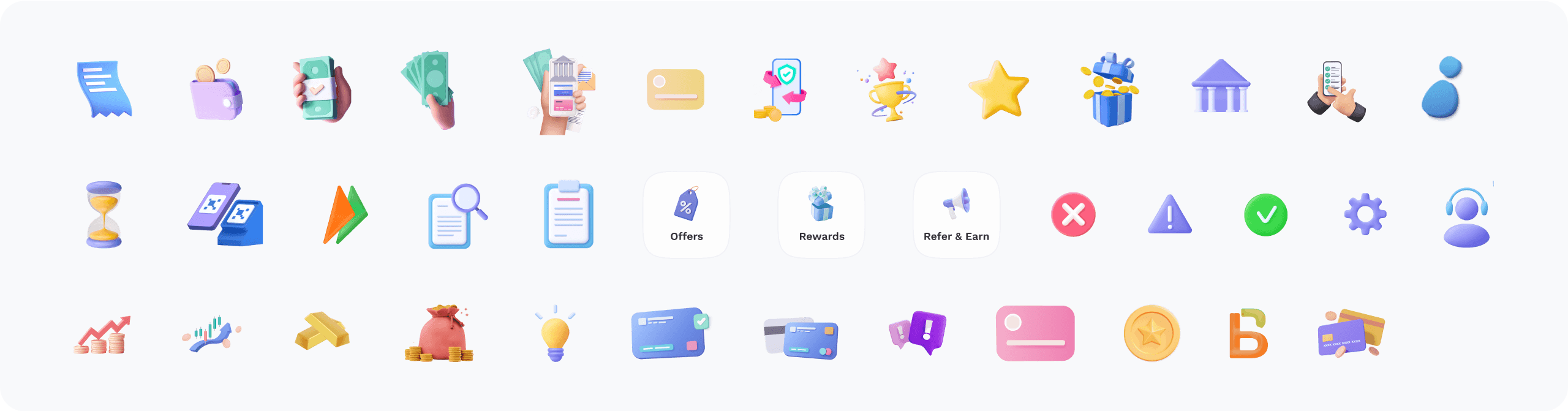
Icon Style
Card
Assets
Account Services

3D Icon Style
Account Overview
Primary Small CTA
Rounded corner 6px / Button height 34px / Colour #0662B7
Usage: Used within a card for card width 280px
Cairo- SemiBold / Font size 14 px / Colour #FFFFFF
Text in this CTA
240px
Primary CTA’s
Account Overview
Primary Medium CTA
Rounded corner 6px / Button height 38px / Colour #0662B7
Usage: Used within a card for card width 320px
Cairo- SemiBold / Font size 14 px / Colour #FFFFFF
Text in this CTA
38px
280px
Primary Medium CTA Disabled
CTA Colour #82B1DB/ Text colour #FFFFFF
Account Overview
34px
280px
Reinvest
Primary Smallest CTA
Rounded corner 6px / Button height 30px / Colour #0662B7
Usage: Used within a card for card width lesser than 280px
Cairo- SemiBold / Font size 11 px / Colour #FFFFFF
Text in this CTA
30px
110px
Primary Smallest CTA Disabled
CTA Colour #82B1DB/ Text colour #FFFFFF
Reinvest
30px
110px
Account Overview
Primary Large CTA
Rounded corner 6px / Button height 38px / Colour #0662B7
Cairo- SemiBold / Font size 14 px / Colour #FFFFFF
Text in this CTA
38px
320px
Primary Large CTA Disabled
CTA Colour #82B1DB/ Text colour #FFFFFF
Account Overview
320px
Primary Small CTA Disabled
CTA Colour #82B1DB/ Text colour #FFFFFF
Account Overview
34px
240px
View Transactions
View Transactions
View Transactions
Reinvest
Seconadry Large CTA
Seconadry Medium CTA
Seconadry Small CTA
Seconadry Smallest CTA
Seconadry Large CTA Disabled
Seconadry Medium CTA Disabled
Seconadry Small CTA Disabled
Seconadry Smallest CTA Disabled
Rounded corner 6px / Button height 38px / Colour #0662B7
Rounded corner 6px / Button height 38px / Colour #0662B7
Rounded corner 6px / Button height 34px / Colour #0662B7
Rounded corner 6px / Button height 30px / Colour #0662B7
Usage: Used within a card for card width 320px
Usage: Used within a card for card width 280px
Usage: Used within a card for card width lesser than 280px
Cairo- SemiBold / Font size 14 px / Colour #FFFFFF
Cairo- SemiBold / Font size 14 px / Colour #FFFFFF
Cairo- SemiBold / Font size 14 px / Colour #FFFFFF
Cairo- SemiBold / Font size 11 px / Colour #FFFFFF
CTA Colour #82B1DB/ Text colour #FFFFFF
CTA Colour #82B1DB/ Text colour #FFFFFF
CTA Colour #82B1DB/ Text colour #FFFFFF
CTA Colour #82B1DB/ Text colour #FFFFFF
Text in this CTA
Text in this CTA
Text in this CTA
Text in this CTA
View Transactions
View Transactions
View Transactions
Reinvest
Secondary CTA’s
280px
34px
280px
30px
110px
110px
34px
240px
38px
320px
38px
34px
240px
Set A SI For This Transaction
Learn more
Set A SI For This Transaction
Link Text Large
Link Text Small
Link Text Large Disabled
Button height 21px
Button height 20px
Cairo- SemiBold / Font size 14 px / Colour #FFFFFF
Cairo- SemiBold / Font size 11 px / Colour #FFFFFF
Colour #82B1DB
Text in this Link
Text in this Link
Link Text’s
5px
5px
20px
Credit score
Tertiary Button
Other Buttons, Tabs and Chips
Button height 21px
Usage: Only for offers and cibil score card
Text in this Button
Cairo- SemiBold / Font size 11 px / Colour #FFFFFF
All Products
My Dashboard
TAB Style
Chips
Height 24px / Active tab color #0662B7 with Stroke width according to label/ Inactive tab color #0662B7 with 3px of stroke width
Padding between labels - 30px
Text in Tabs
Cairo- SemiBold / Font size 13 pxl /
Colour #333333
Height 34px / Active tab color #0662B7 / Inactive tab color #E9EAEB
Padding inside Chips -10px Padding between Chips - 10px
Text in Tabs
Cairo-Semi Bold / Font size 12 pxl /
Colour #FFFFFF - Active / #333333 - Inactive
Within 3 months
More than 3 months ago
I don’t remember
360px
34px
21px
Other Components
Checkbox
Toggle Button
Selectors
Size 18px / Stroke 1px
Stroke Colour #282829
Rounded corner 6px
Colour #DBE1E8
Selected state Colour #27BC24
Rounded corner 7px Button height 15px
Inactive button colour #DBE1E8
Active button colour #0662B7 #FFFFFF
Usage: Used when grey bg is there
Size 18px
Colour #E9EAEB
Selected Colour #0662B7
Usage: Used when white bg is there
Usage: Used within a card for card width 320px
Manufacturer and model
Bajaj Puslar 180 DTSI Electric Start...
Manufacturer and model
Type your bike name. e.g. Avenger
Popular Bikes
TVS Apache RTR 160 (160cc)
Hero Honda Glamour (125cc)
Honda CB Shine (125cc)
Honda Activa (110cc)
Bajaj Avenger 220 (220cc)
Dropdown
Search service
|
Search Bar
Rounded corner 12px
Width 290px Height 54px
Colour #ffffff / Outline colour #E8EBF5
Text #838383
Add Filter
Add Filter
Filter
Default state
Applied state
Month
Status
Feb 2021
Successful
DropDown:
Font - Cairo - Regular 13px/ Color #0662B7
Chip:
Font - Cairo - Regular 12px/ Color #E9EAEB - Font Color #333333
Padding inside Chips -10px Padding between Chips - 10px
Background color:
Font - Cairo - Medium 14px/ Font Color #333333
Background color #F3F3F4
Inside square:
Font - Cairo - Medium 14px/ Font Color #333333
Color #FFFFFF / Stroke #BDBEC8
June 2022
S
M
T
W
T
F
S
31
1
2
3
4
5
6
7
8
9
10
11
12
13
14
15
16
17
18
19
20
21
22
23
24
25
26
27
28
29
30
1
2
3
4
Full Size Calendar
Small Size Calendar
Counter
2010-2019
2009
2010
2011
2012
2013
2014
2015
2016
2017
2018
2019
2020
12
Cairo- Medium / Font size 12px /
Colour #838383 / Line color #BDBEC8
Error message font - Cairo - Regular 12px/ Color #D72027 / Line color #D72027
Text label color #333333
Warning color #F19529
Cairo- Semi Bold / Font size 14px /
Colour #333333 / Line color #BDBEC8
Cairo- Medium / Font size 12px /
Colour #838383
Default state
Error state
Filled state
Warning state
While Typing
With icon
Error message
Amount
₹10,000
|
Warning message
Amount
₹10,000
|
Text Fields
Font - Cairo - Regular 8px/ Color #333333 / BG color #E9EAEB
Font - Color #50D656 / BG color #F2FFF3
Font - Color #D78320 / BG color #FFF4E2
Font - Color #D78320 / BG color #FFF4E2
Font - Color #D72027 / BG color #FFF2F2
Default state
Positive
Warning / Due
Information tag
Negative
Tags
Declined
Unpaid
Processed
Processed
Font - Color #50D656 / BG color #F2FFF3
Alert tag
new
Font - Cairo - Regular 8px/ Color #333333 / BG color #E9EAEB
Alert tag with icon
30%
active
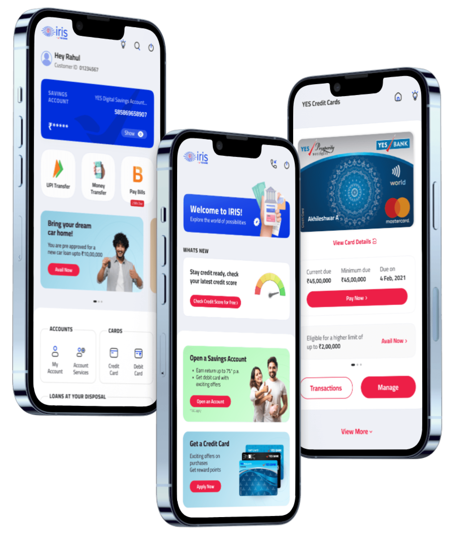
the final product
brand vision
To reflect Yes Bank’s commitment to modern, accessible banking solutions, the app needed to combine functionality with a forward-thinking design that resonates with users on an emotional level, building trust and engagement in the digital age.
To reflect Yes Bank’s commitment to modern, accessible banking solutions, the app needed to combine functionality with a forward-thinking design that resonates with users on an emotional level, building trust and engagement in the digital age.
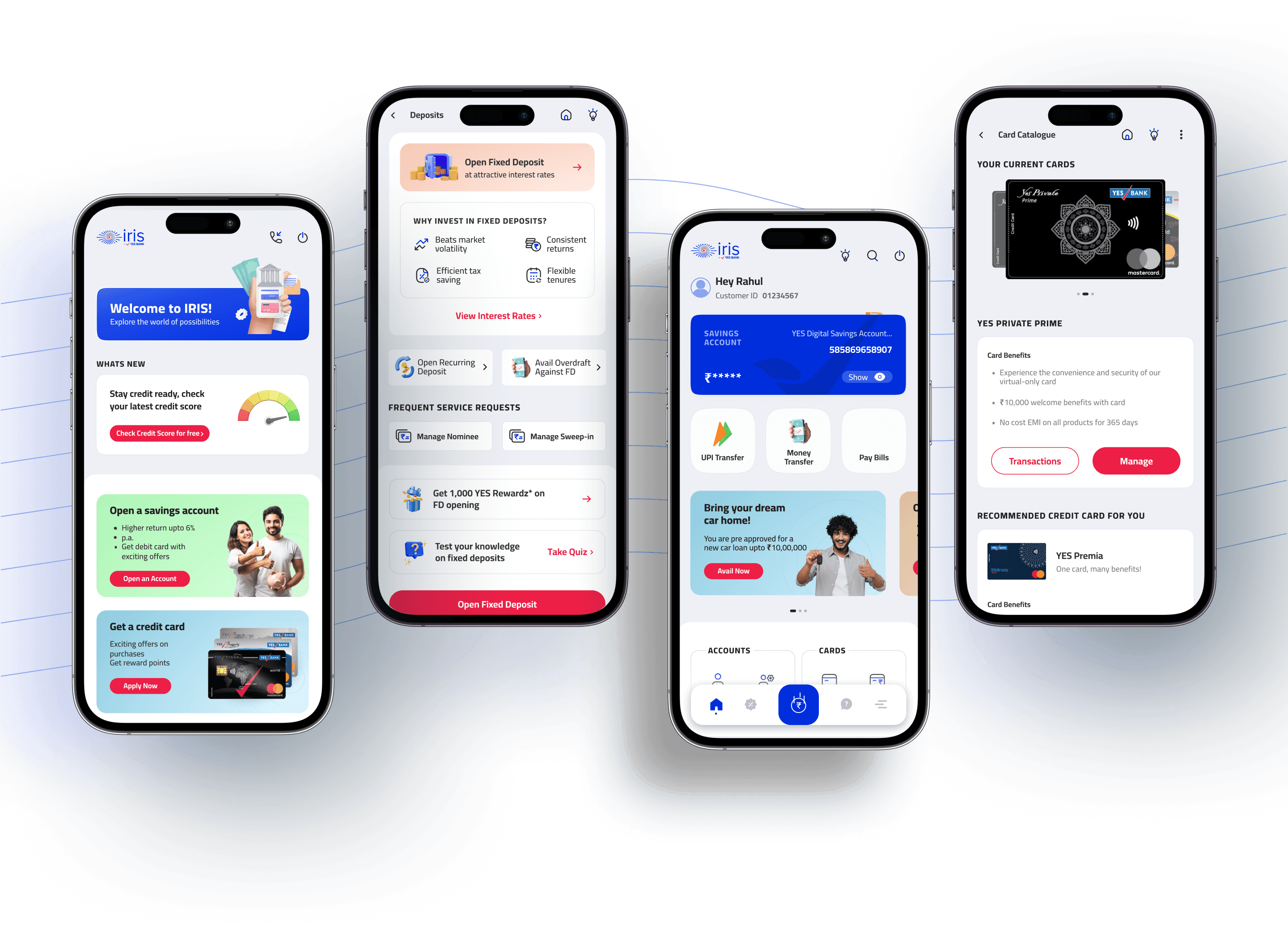
Navigating with Ease
A key challenge in designing the YES BANK IRIS mobile app was ensuring easy access to various banking services without overwhelming users. Streamlined menus and intuitive navigation, along with distinct UI iconography for core tasks like payments and transfers, enabled quick access and improved decision-making.
A key challenge in designing the YES BANK IRIS mobile app was ensuring easy access to various banking services without overwhelming users. Streamlined menus and intuitive navigation, along with distinct UI iconography for core tasks like payments and transfers, enabled quick access and improved decision-making.